

AI Integration Quick Reference
AI Integration Quick Reference
Overview
The MessageBubble styling API allows developers to customize the appearance of incoming and outgoing message bubbles globally or at the component level. This includes various message types such as text, image, video, audio, file, and document bubbles. There are two primary classes for styling message bubbles:- CometChat Incoming Message Bubble Style
- CometChat Outgoing Message Bubble Style
Properties
Global Styling (Static Variables)
Specific Message Type Styles
Customization Examples
Customizing Incoming Message Bubble
The following code snippet shows how to customize the incoming message bubble style:- Swift
Customizing Outgoing Message Bubble
The following code snippet shows how to customize the outgoing message bubble style:- Swift
Text Bubble
Text bubbles display plain text messages, which are the most common message type. The following code snippet shows how to customize the text message bubble:- Swift
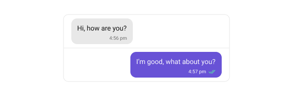
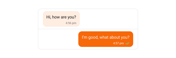
Link, Phone Number and Email Colors
Text bubbles automatically detect URLs, phone numbers and email addresses and render them as tappable links. Each entity type has its own color property, so links can be styled independently of phone numbers and emails.
All three properties are optional. When one is
nil, that entity falls back to textHighlightColor, which resolves to the theme’s info color for incoming bubbles and white for outgoing bubbles — the default appearance. Underlines follow the resolved text color automatically.
- Swift
- Swift
Messages that render a Link Preview Bubble inherit these three colors from
textBubbleStyle, so setting them once covers both plain text messages and messages with a preview card. Set them on linkPreviewBubbleStyle only when preview messages need different colors — see Link Colors in the Preview Bubble.Image Bubble
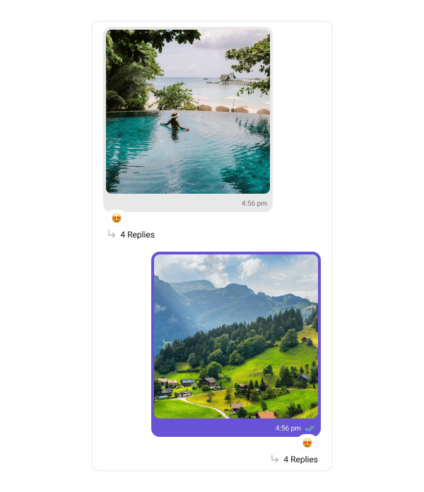
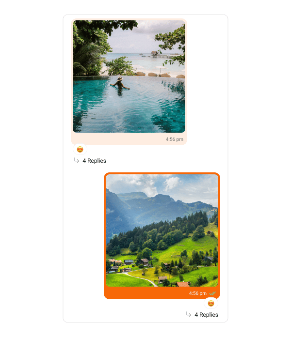
Image bubbles display messages with images. The following code snippet shows how to customize the image message bubble:- Swift
Video Bubble
Video bubbles display messages with video clips. The following code snippet shows how to customize the video message bubble:- Swift
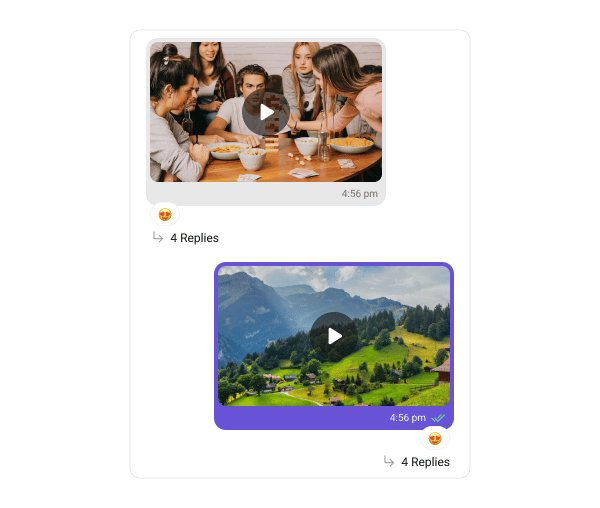
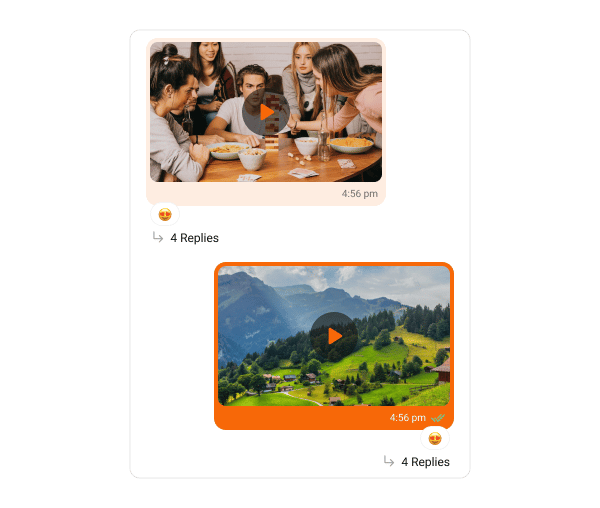
Audio Bubble
Audio bubbles display audio messages. The following code snippet shows how to customize the audio message bubble:- Swift
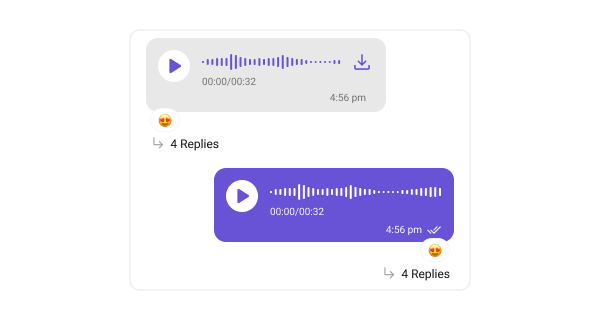
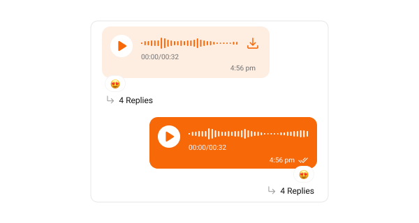
Media Grid Bubble
Media grid bubbles render messages that carry multiple image or video attachments as a count-based grid (1, 2, 3, 4, or 5+ tiles). When there are more items than visible tiles, the last tile shows a “+N” overflow badge; video tiles carry a play badge and duration pill. Tapping any tile opens the fullscreen media viewer with swipe navigation, pinch-to-zoom, inline video playback, per-photo download, and share.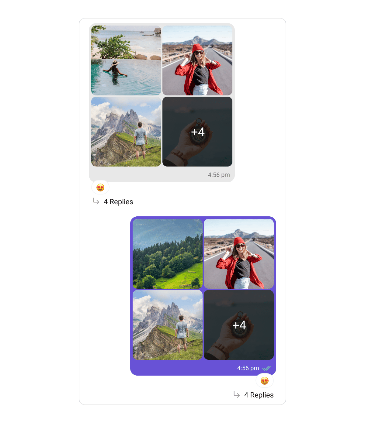
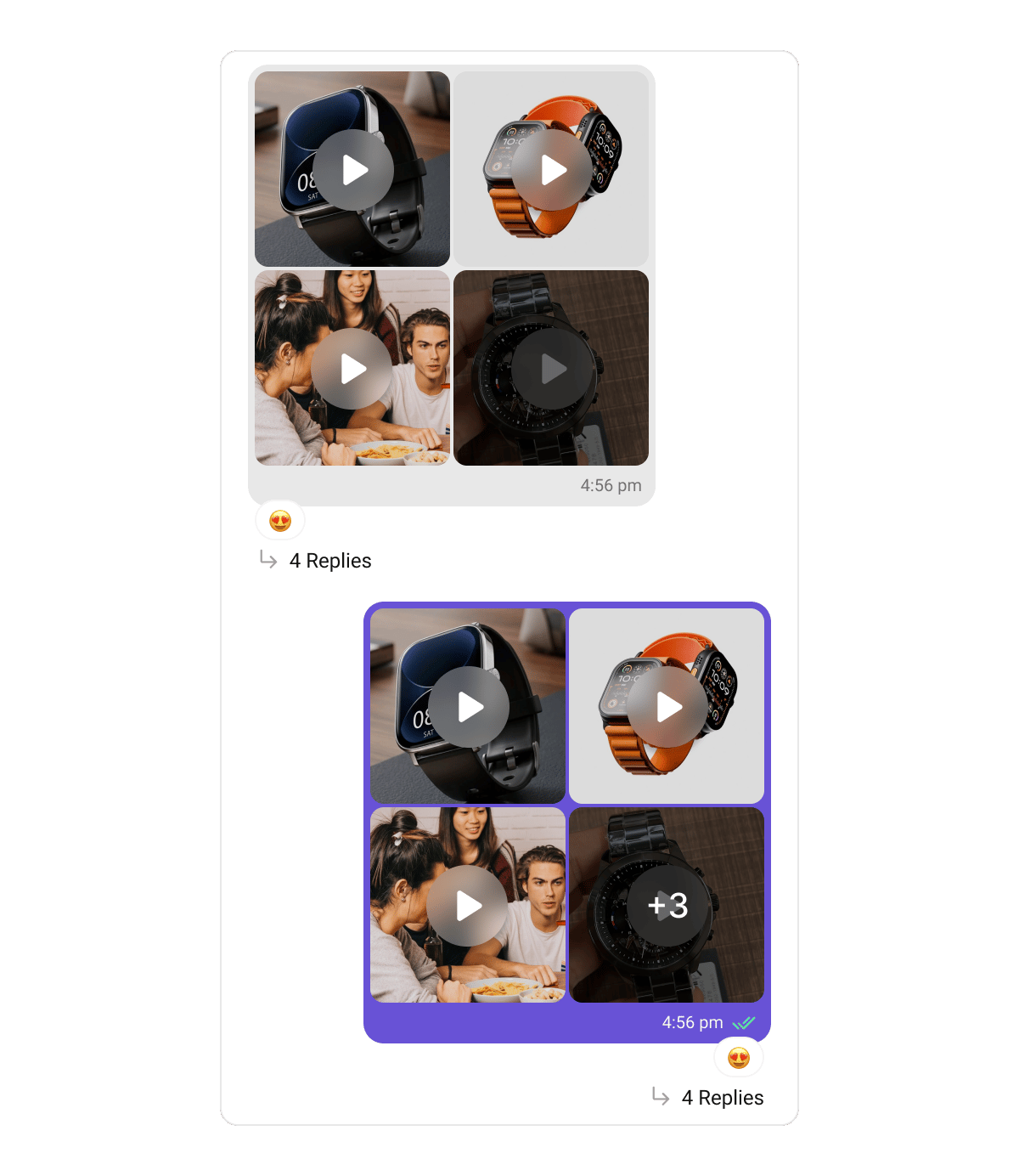
GalleryBubbleStyle:
- Swift
GalleryBubbleStyle properties for the grid:
Audio Files Bubble
Audio files bubbles render messages carrying audio file attachments — one playback row per file, with a play/pause button, a seekable progress slider, the duration, the file name, and a download control. Only one row plays at a time.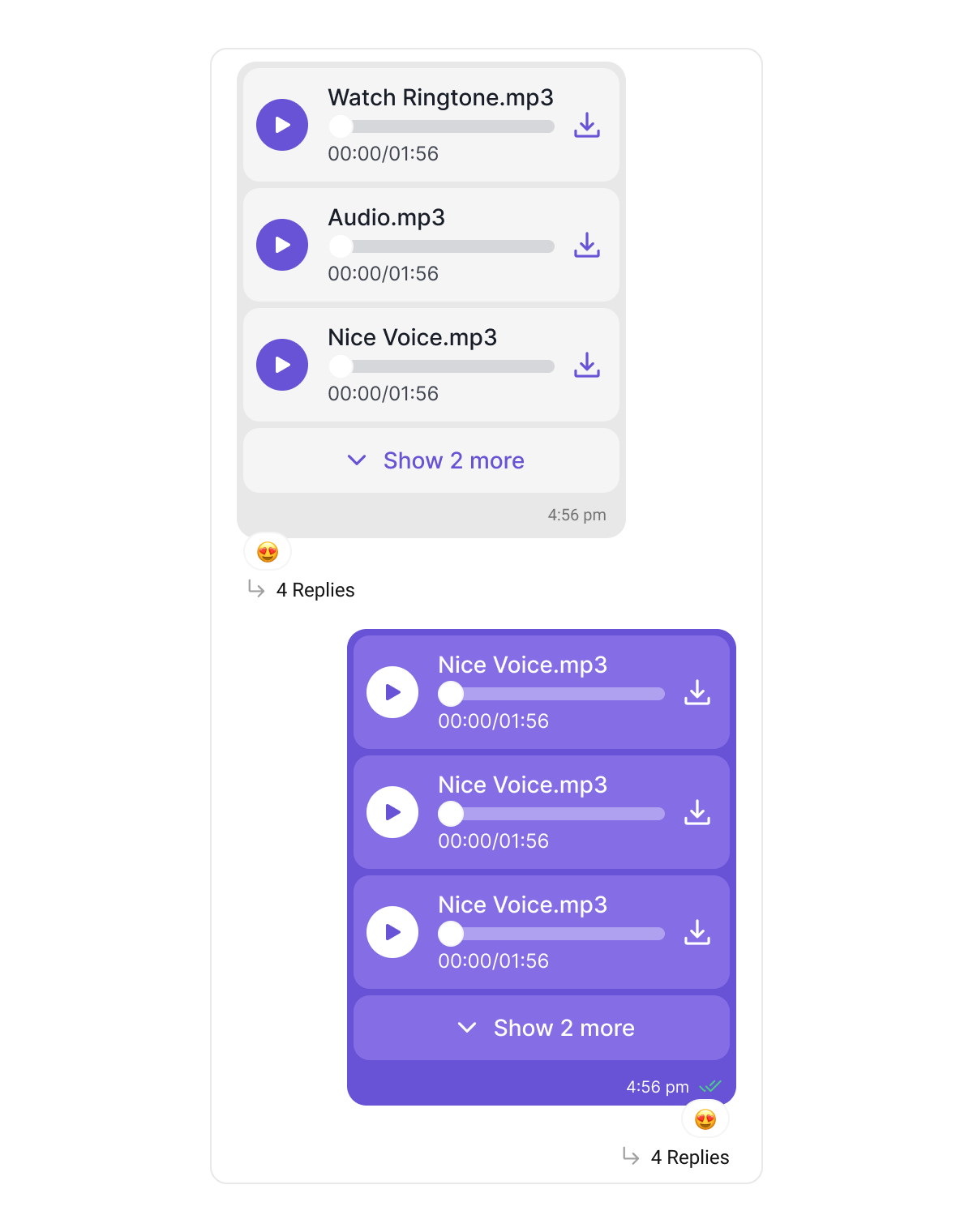
This bubble is distinct from the Audio Bubble above, which renders voice notes recorded with the composer’s microphone. Voice notes keep their waveform look and are never grouped with other attachments.
GalleryBubbleStyle (sectionSpacing, captionFont, captionColor), and flip their colors automatically on outgoing bubbles.
Files Bubble
Files bubbles render messages carrying document attachments as a connected stack of file cards — each with a file-type icon (PDF, Word, Excel, PowerPoint, ZIP, …), the file name, and its metadata. Four or more files collapse behind a “+N more” toggle. Tapping a card opens the file: a downloaded copy previews in-app, otherwise the file is offered through the share sheet.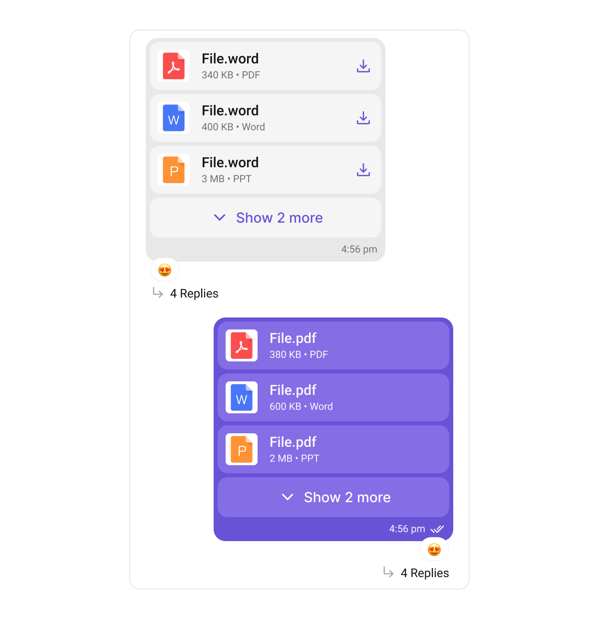
GalleryBubbleStyle:
- Swift
GalleryBubbleStyle properties for file cards and the shared caption row:
Captions containing rich text (code blocks, quote blocks, inline code) render through the same pipeline as Text Bubbles, so their formatting looks identical across message types.
Poll Bubble
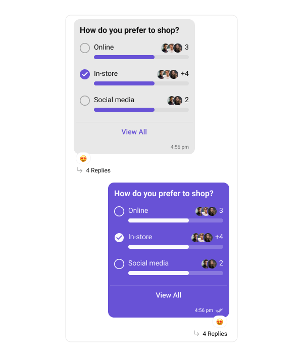
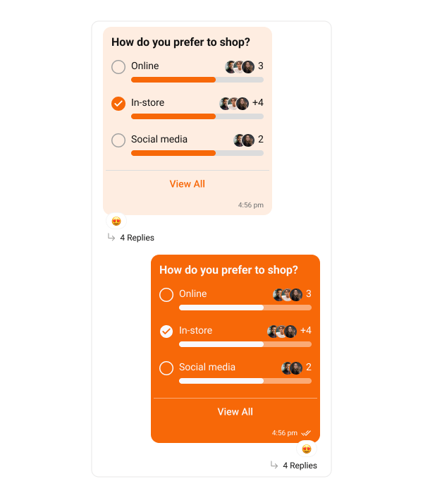
Poll bubbles display messages with polling options. The following code snippet shows how to customize the poll message bubble:- Swift
Link Preview Bubble
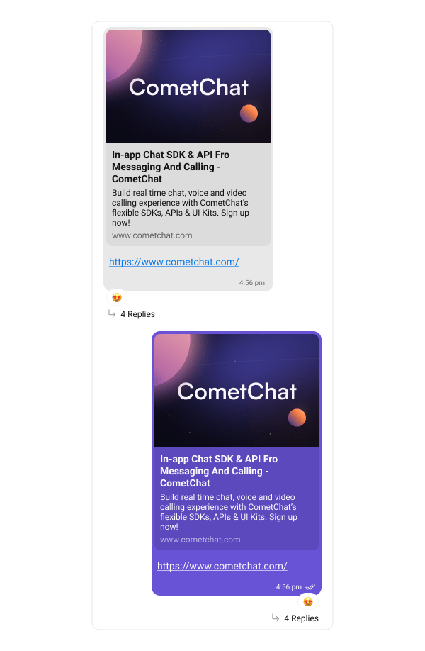
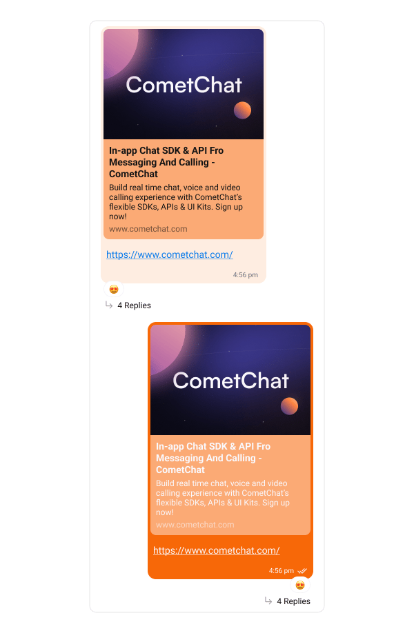
The Link Preview Bubble displays a preview of links shared in messages. It enriches the messaging experience by showing details such as the page title, description, and an image from the linked content, making links more engaging and informative. The following code snippet shows how to customize the link preview message bubble:- Swift
Link Colors in the Preview Bubble
LinkPreviewBubbleStyle exposes the same three entity color properties as Text Bubble, so the message text inside a preview bubble can be colored the same way.
These colors are inherited from textBubbleStyle automatically. Assigning them on the text bubble style applies them to preview bubbles too, so plain text messages and preview messages match without configuring both:
- Swift
linkPreviewBubbleStyle always wins over the inherited value, which lets preview messages differ:
- Swift
Inheritance runs each time
textBubbleStyle is written and only fills colors still unset on linkPreviewBubbleStyle. Once a preview color is set explicitly it is never overwritten, so later changes to the text bubble’s link colors will not reach it.Preview card labels
The properties above color the tappable link inside the message text. The preview card’s own labels are separate and unaffected:linkTextColor and textLinkColor are easy to confuse. linkTextColor styles the static URL caption printed under the preview card; textLinkColor styles the tappable link in the message text.Action Bubble
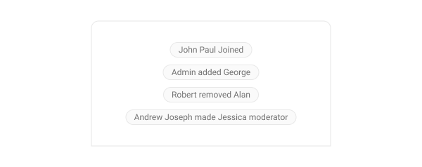
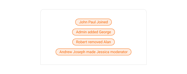
Action bubbles provide a customizable interface for displaying a variety of actions, such as group actions, within a chat. The following code snippet shows how to customize the action message bubble:- Swift
Delete Bubble
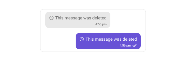
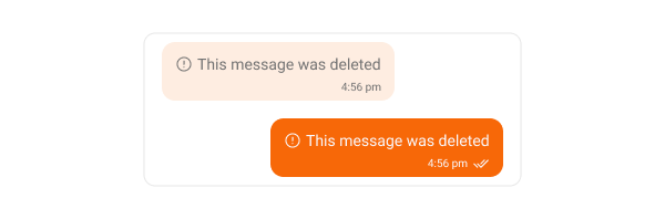
Delete bubbles display messages that have been deleted by the sender. These indicate the message removal within the chat interface. The following code snippet shows how to customize the delete message bubble:- Swift
AI Assistant Bubble
The AI Assistant Bubble displays responses or messages sent by the AI assistant within the chat interface. These bubbles are designed to visually distinguish AI-generated messages from user messages, maintaining a clear and intuitive conversation flow. You can customize the appearance of the AI Assistant message bubble to match your app’s theme — including background color, text color, font, and border styling. The following code snippet shows how to customize the AI Assistant message bubble:- Swift
Next Steps
Message List
Display and customize the message list component
Message Composer
Customize the message input component
Component Styling
Learn about global styling options